MangoBooks

UI Mood
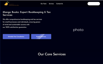
Since the client wanted to break away from the industry norm of stark white layouts, stock imagery, and text-heavy explanations of financial concepts, I went with a more relaxed, California-inspired direction.
The goal was to communicate a a friendlier, lower-stress approach to something that’s usually stressful — taxes.
*names, phones, maps were omitted for privacy
Consistency
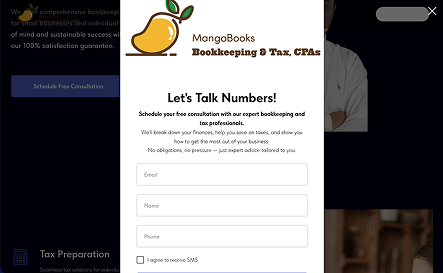
While the logo and website mismatch had already been identified, the overall visual system of the site felt inconsistent.
One major issue was a pop-up prompt that used an aggressively white background, which disrupted the otherwise dark, sleek visual language of the site.
I redesigned the pop-up to match the darker theme, so it no longer breaks the visual flow.