OKHealth

The brand was designed to soften the typically rigid nature of medical scheduling systems through a friendly, approachable tone. To support this, I created a mascot-style logo using two pills, introducing warmth and personality.
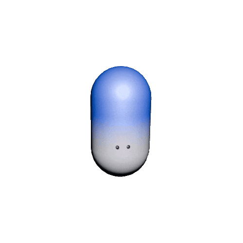
The mascot isn’t a central interactive element, so it didn’t need to be highly versatile.
Instead, it was designed to match the app’s color palette and overall tone, reinforcing visual consistency.