Quackwell

Color Palette
A pastel palette was chosen to align with the mascot and create a softer, more approachable tone.
Since the app is meant to be used frequently, I avoided high-contrast color combinations that felt visually harsh, and instead balanced warm yellows with cool blues to maintain clarity without overwhelming the interface.
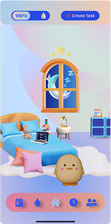
Main Hub
The “room” concept draws from patterns seen in similar habit-building apps, where giving the mascot a spatial environment helps reinforce progression and daily engagement.
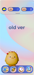
The navigation bar was redesigned to improve scannability and reduce cognitive load.
The original 3D icons, while stylistically consistent, made actions harder to distinguish at a glance. Switching to simpler vector icons improved recognition speed and usability.
Components
Since I was building the app in React Native, I used reusable components to keep the UI consistent and easier to implement.