Quackwell

Sign Up Flow
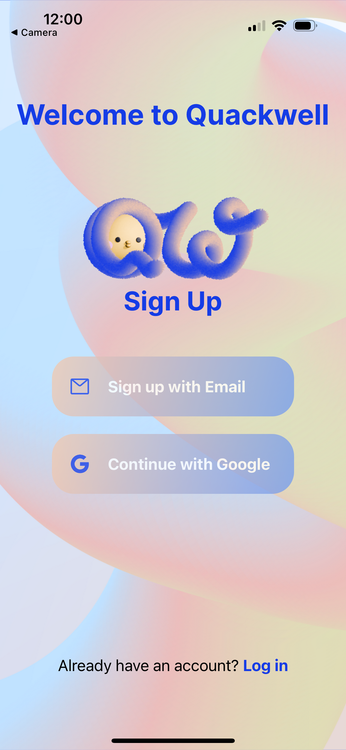
You open Quackwell for the first time and land on a “Let’s Get Started” screen. There’s no task list yet — just the duck and a slightly whimsical name doing one job: setting expectations.
This isn’t a rigid wellness app, and it doesn’t want to feel like one. There’s a single call-to-action. You tap it and move forward.
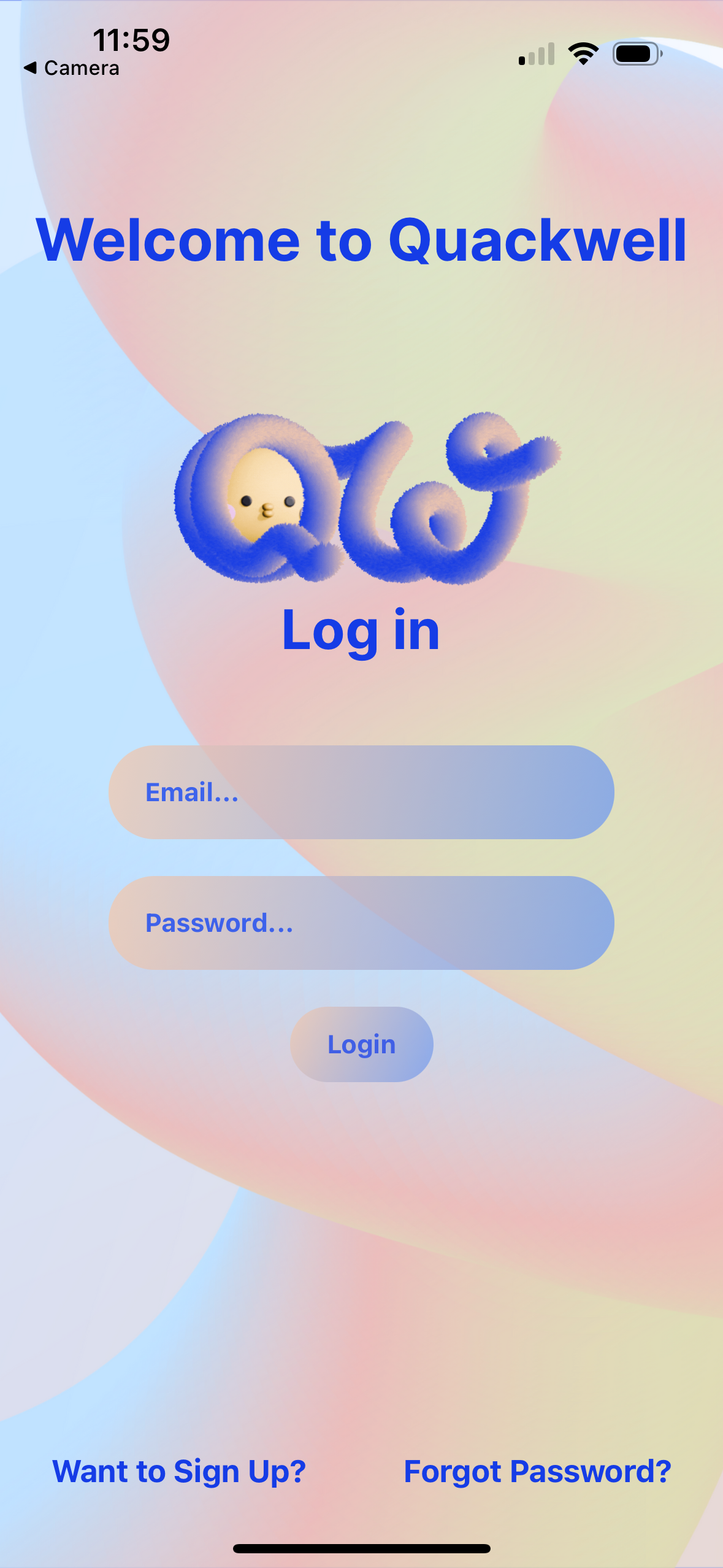
Choosing email sign-up leads to a short form. The app asks only for what it actually needs. A wellness app built around encouragement doesn’t need your full life story, and adding friction here would work against the tone set earlier.
You land in the Main Hub — the center of the app. From here, every core feature is reachable, giving you orientation immediately instead of making you hunt for it.
No Wheel Reinventing
Wherever possible, Quackwell sticks to established mobile interaction patterns. Familiar gestures and visual conventions are used intentionally, so interactions feel predictable and easy to learn.
This keeps cognitive load low and lets users focus on their habits, not the interface.